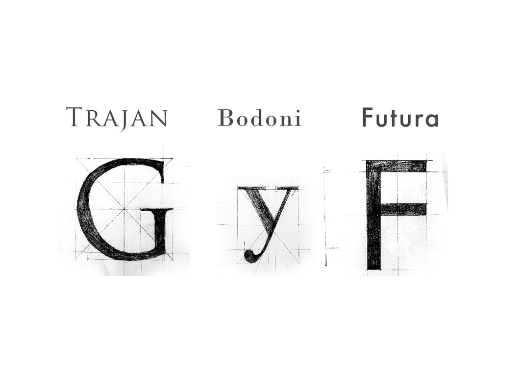
The following project, in partnership with my colleague Inês Ferraz, presents the study of three letters, G and F from Trajan and Future and y from Bodoni. The recreation was made through manual drawing that was transformed digitally into a vector. Then, the different components of the letters were studied. We made several comparisons with the reflections and optical compensations as well as numerical constructions using a grid made with essencial points of each letter. The fonts used in the five kerning systems were Times and Helvetica. The concept of the project is related to the geometric forms associated with each letter, as well as the primary colours cyan, magenta and yellow, which are connected with the shapes.
|
|
|
'Typographic Drawing', Academic project
References https://www.pinterest.pt/inesferraz16/design-tipografico/
Team Inês Ferraz and Laura Rodrigues
Typographic study, editorial, Japanese book binding
Undergraduation in Communication Design
Faculty of Fine Arts of the University of Porto
April 2017
References https://www.pinterest.pt/inesferraz16/design-tipografico/
Team Inês Ferraz and Laura Rodrigues
Typographic study, editorial, Japanese book binding
Undergraduation in Communication Design
Faculty of Fine Arts of the University of Porto
April 2017
